Galerie de prompts IA OpenZhenZhen · gpt-image-2.5 · image
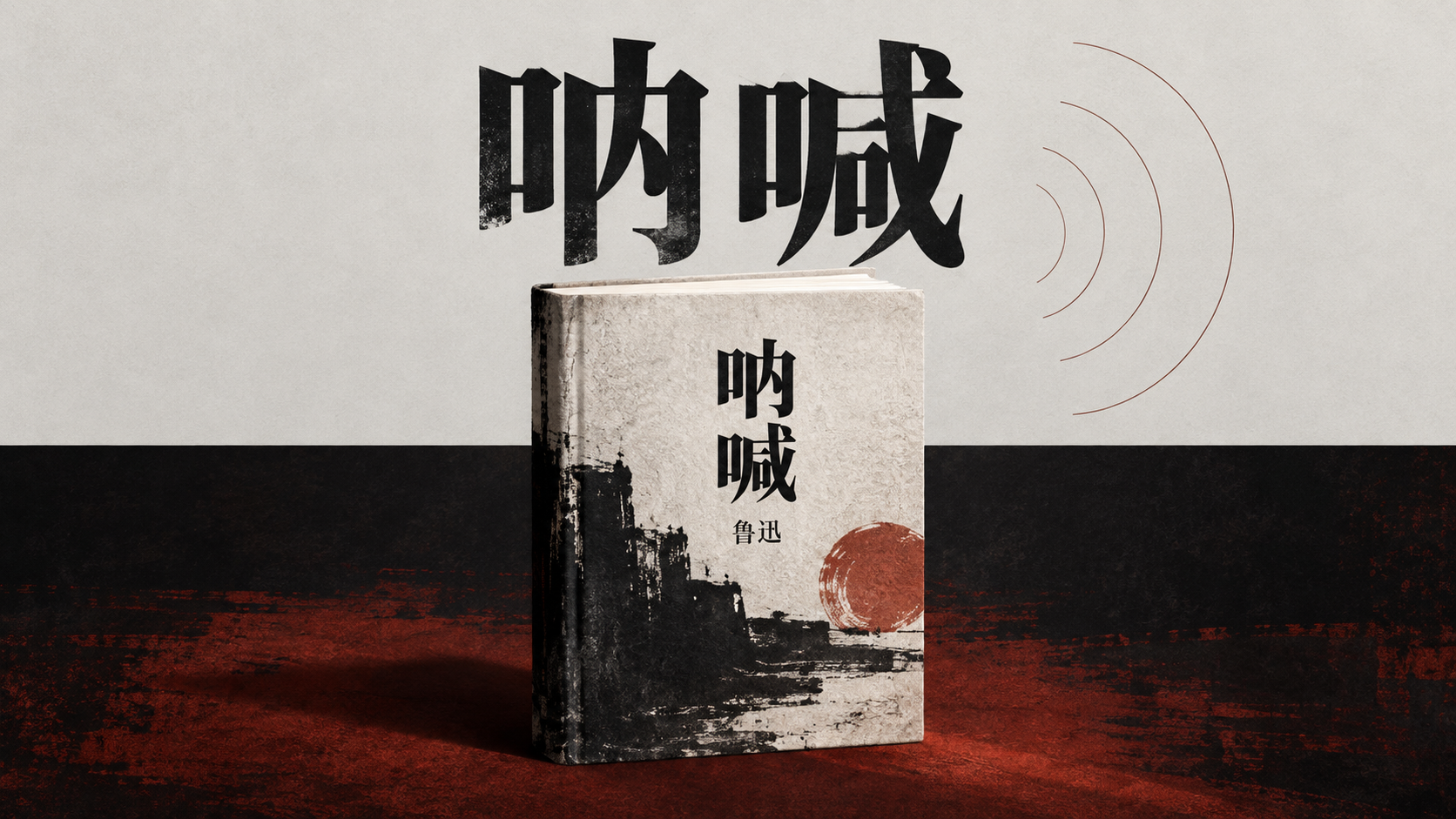
Le Cri de Lu Xun : affiche de recommandation croisée
Lu Xun's Call to Arms: Cross-Venue Editor's Pick Poster
Le Cri de Lu Xun : affiche de recommandation croisée — découvrez cette création avec gpt-image-2.5 sur OpenZhenZhen, son prompt original et un exemple de génération à réutiliser.
Prompt
Prompt chinois
创作一张16:9横版、现代编辑设计风格的鲁迅《呐喊》书籍推荐海报。版面分为两个清晰可见的水平场域:上方为浅色、低饱和、留白充足的概念空气场;下方为色彩更浓、视觉更有承托感的实体体验场。两场之间采用明确的硬切色面边界,像平面设计结构,不画成自然地平线或真实风景。 核心对象是一册有厚度的书,位于画面中轴略偏下并横跨上下分界:书的上缘进入浅色概念场,主体落在较深的体验场中,书脊、封面和纸页具有细腻、可触摸的纸张层次。它像一座连接思想与阅读体验的桥。封面以简洁克制的现代设计呈现,准确显示大字“呐喊”,并在较小位置显示作者名“鲁迅”;只出现这两处可读文字,不复制任何真实版本封面,不添加出版年份、引文或未经提供的书目信息。 上方让“呐喊”成为有力的标题图形,可与书封标题呼应但不要堆叠成重复乱码;黑色或近黑色的硬朗字形形成强烈尺度对比。下方体验场使用深墨色、暗朱红或温暖纸色作为结构色,用少量锐利高光和主题触发色突出书的体积。书页边缘与封面内部呈现最高细节密度:纤维纸纹、墨迹渗化、压印轮廓与细微颗粒清楚可见;背景、符号和辅助信息保持平面、干净、低噪声。 在浅色概念场安排一个由“呐喊”主题联想到的空心单线回声符号,线条简洁、低密度,不画人物、嘴部或写实扩音器。边缘可留少量短注释形状和低对比页脚信息带,但除“鲁迅”和“呐喊”外不生成其他可读文字、数字、年份、伪字或水印。保持宽阔留白、非对称平衡、稳定中轴主体和清晰双场关系;视觉第一眼看到上下硬切、跨界书本、大字标题与克制回声符号。
Prompt anglais
Create a 16:9 horizontal modern editorial book-recommendation poster for Lu Xun's Call to Arms. Divide the layout into two clearly visible horizontal fields: a light, low-saturation conceptual air field with generous negative space above, and a more saturated, grounded experiential field below. Separate them with a deliberate hard-cut color-plane boundary that reads as graphic layout structure, not a natural horizon or realistic landscape. Place one substantial book on the central axis, slightly below center and crossing the boundary: its top edge enters the pale conceptual field while most of its mass rests in the darker experiential field. Show tactile paper layers, a defined spine and a restrained contemporary cover; the book acts as a bridge between ideas and reading experience. Print the exact large Chinese title “呐喊” on the cover and the smaller author name “鲁迅”. Show only these two readable text elements. Do not reproduce a real historical edition cover or invent a publication year, quotation or bibliographic claim. Let “呐喊” also function as a strong title graphic in the upper conceptual field, related to but not cluttered by the cover title. Use a bold, tough black or near-black type structure with a pronounced scale contrast. Build the lower experiential field from deep ink tones, muted dark vermilion or warm paper hues, with a small precise accent color and restrained highlights to define the book's volume. Concentrate the highest detail density inside the book: visible paper fibers, softly bleeding ink, embossed contours and fine grain. Keep the background, symbol and ancillary layout flat, clean and low-noise. Add one hollow single-line echo motif in the pale conceptual field, derived from the idea of a literary call or resonance. Keep it simple and sparse; do not depict a person, mouth or realistic loudspeaker. Edge annotations and a very shallow quiet footer band may be suggested as layout shapes, but generate no other readable words, numbers, dates, pseudo-text or watermark beyond “呐喊” and “鲁迅”. Preserve generous negative space, asymmetrical balance, a stable central book and a clear dual-field structure. At first glance, the viewer should read the hard division, cross-field book, bold title and restrained echo symbol.
Découvrir plus de prompts image et vidéo · Générer des images · Générer des vidéos · Créer sur le canevas IA
Œuvres associées
- Neuf clichés ratés de femmes adultes pris au téléphone
Neuf clichés ratés de femmes adultes pris au téléphone — découvrez cette création avec gpt-image-2.5 sur OpenZhenZhen, son prompt original et un exemple de génération à réutiliser.
- Portrait documentaire d'une femme est-asiatique adulte dans le métro avec son téléphone
Portrait documentaire d'une femme est-asiatique adulte dans le métro avec son téléphone — découvrez cette création avec gpt-image-2.5 sur OpenZhenZhen, son prompt original et un exemple de génération à réutiliser.
- Photo volée ultra grand-angle d'une femme adulte en mode sombre dans une vieille gare japonaise
Photo volée ultra grand-angle d'une femme adulte en mode sombre dans une vieille gare japonaise — découvrez cette création avec gpt-image-2.5 sur OpenZhenZhen, son prompt original et un exemple de génération à réutiliser.
- Portrait de mode d'une femme adulte d'Asie de l'Est en ensemble bleu glacé dans un izakaya
Portrait de mode d'une femme adulte d'Asie de l'Est en ensemble bleu glacé dans un izakaya — découvrez cette création avec gpt-image-2.5 sur OpenZhenZhen, son prompt original et un exemple de génération à réutiliser.
- Affiche expérimentale croisée en diagonale sur le thème du champ fleuri
Affiche expérimentale croisée en diagonale sur le thème du champ fleuri — découvrez cette création avec gpt-image-2.5 sur OpenZhenZhen, son prompt original et un exemple de génération à réutiliser.
- Portrait d'une femme dans un champ de fleurs jaunes avec montagnes
Portrait d'une femme dans un champ de fleurs jaunes avec montagnes — découvrez cette création avec gpt-image-2.5 sur OpenZhenZhen, son prompt original et un exemple de génération à réutiliser.