OpenZhenZhen AI プロンプトギャラリー · gpt-image-2.5 · image
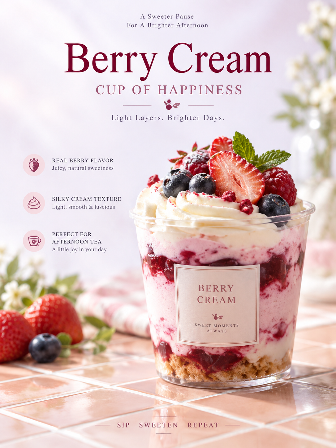
ベリーとクリームのデザートカップ 商業用静物ポスター
Berry Cream Dessert Cup Commercial Still Life Poster
「ベリーとクリームのデザートカップ 商業用静物ポスター」は gpt-image-2.5 を使用した作品です。OpenZhenZhen で元のプロンプトと生成例を確認し、創作の参考にできます。
プロンプト
中国語プロンプト
创作一张明亮的竖版 3:4 商业静物海报,主题是一款适合下午茶的轻甜莓果奶油甜品杯。让单一且最具识别度的甜品杯成为纪念碑式视觉主角,置于中轴略偏右,从底部一条自左下向右上的斜向瓷砖台面后方升起,底部被台面局部遮挡。台面采用温润釉面、克制反光和细窄浅色勾缝,规整方格随透视延展。上半部保留大块通透暖白留白,使用由莓果主题派生的明亮冷色浅背景,只保留极细均匀颗粒、轻微亮度漂移和一处柔和亮雾;整体清爽明快,不要脏污、磨损、厚重褐色滤镜或压暗。表现甜品杯及莓果奶油层次可信的材质结构、透光、反射、细腻高光和真实近拍质感,边缘清晰但不过度锐化。对象上缘附近聚集少量高饱和莓果与奶油装饰细节,杯身正面加入安静的浅色矩形识别面。 保持克制而有活力的色彩层级:背景浅亮低饱和,甜品和瓷砖使用更深的相邻色,点缀、排版和装饰使用少量醒目色,冷暖对比清楚。沿中轴建立纵向编辑阅读秩序:顶部两行极小的主题文案,中部一个基于莓果奶油主题的超大居中高反差衬线标题,下方一行较小衬线副标题,最底部在瓷砖上放紧凑的全大写说明。加入 3 个适合商业使用且源自产品的简洁信息点,例如莓果风味、奶油质地和适合下午茶;文字清晰克制,绝不压住实体甜品。采用精心布置后的自然高调光、轻微光学柔化、真实材质、大胆留白、斜向台面托举和清晰图文秩序。避免杂乱、过度饱和或刺眼反光、浑浊色彩、重 HDR、伪造纹理、不可读随机文案、标志、水印和塑料感 CGI。
英語プロンプト
Create a bright vertical 3:4 commercial still-life poster for a light, sweet berry cream dessert cup suitable for afternoon tea. Make the single most recognizable dessert cup the monumental visual hero, placed slightly right of the central axis and rising from behind a small tiled countertop that enters the bottom edge on a diagonal from lower-left to upper-right; let the counter partially conceal the base. Use a warm glazed tile surface with restrained reflections and fine pale grout forming regular squares in perspective. Reserve generous transparent white space in the upper half with a bright, cool, pale berry-derived background, very fine uniform grain, slight luminance drift, and one soft luminous mist; keep the image refreshing and never dirty, worn, brown-filtered, or dark. Render the cup and its berry cream layers with credible material structure, light transmission, reflections, delicate highlights, clear but not over-sharpened edges, and tactile real-shot texture. Add a small cluster of saturated berry and cream garnish details near the upper edge and a quiet pale rectangular identification panel on the front. Use restrained but energetic color hierarchy: pale low-saturation background, deeper related colors for the dessert and tiles, and small vivid accents for garnish and typography, with clear warm/cool contrast. Build a central vertical editorial reading order: two tiny lines of theme-derived copy at the top, a large centered high-contrast serif title based on the berry-cream theme, a smaller serif subtitle, and a compact all-caps bottom instruction on the tiles. Include three concise commercially useful information points derived from the product, such as berry flavor, cream texture, and afternoon-tea suitability; keep all copy legible, minimal, and never over the physical dessert. Use natural high-key light after careful arrangement, mild optical softness, realistic materials, bold white space, diagonal platform support, and clear graphic order. Avoid clutter, excessive saturation or glare, muddy color, heavy HDR, fake textures, unreadable random copy, logos, watermarks, and CGI-plastic rendering.
画像・動画プロンプトをもっと見る · 画像を生成 · 動画を生成 · AI キャンバスで作成
関連作品
- 90年代クールトーン仙侠風 翡翠色漢服の人物像
「90年代クールトーン仙侠風 翡翠色漢服の人物像」は gpt-image-2.5 を使用した作品です。OpenZhenZhen で元のプロンプトと生成例を確認し、創作の参考にできます。
- 超精巧3Dコミック風スター收藏ポスター
「超精巧3Dコミック風スター收藏ポスター」は gpt-image-2.5 を使用した作品です。OpenZhenZhen で元のプロンプトと生成例を確認し、創作の参考にできます。
- レトロレーシングポスターのデザインプロンプト
「レトロレーシングポスターのデザインプロンプト」は gpt-image-2.5 を使用した作品です。OpenZhenZhen で元のプロンプトと生成例を確認し、創作の参考にできます。
- ちびキャラチャットスタンプ生成プロンプト
「ちびキャラチャットスタンプ生成プロンプト」は gpt-image-2.5 を使用した作品です。OpenZhenZhen で元のプロンプトと生成例を確認し、創作の参考にできます。
- 子ども向け科学百科ポスター ミツバチを知ろう
「子ども向け科学百科ポスター ミツバチを知ろう」は gpt-image-2.5 を使用した作品です。OpenZhenZhen で元のプロンプトと生成例を確認し、創作の参考にできます。
- ファッションカラーブロックコラージュポートレート写真
「ファッションカラーブロックコラージュポートレート写真」は gpt-image-2.5 を使用した作品です。OpenZhenZhen で元のプロンプトと生成例を確認し、創作の参考にできます。