OpenZhenZhen AI プロンプトギャラリー · gpt-image-2.5 · image
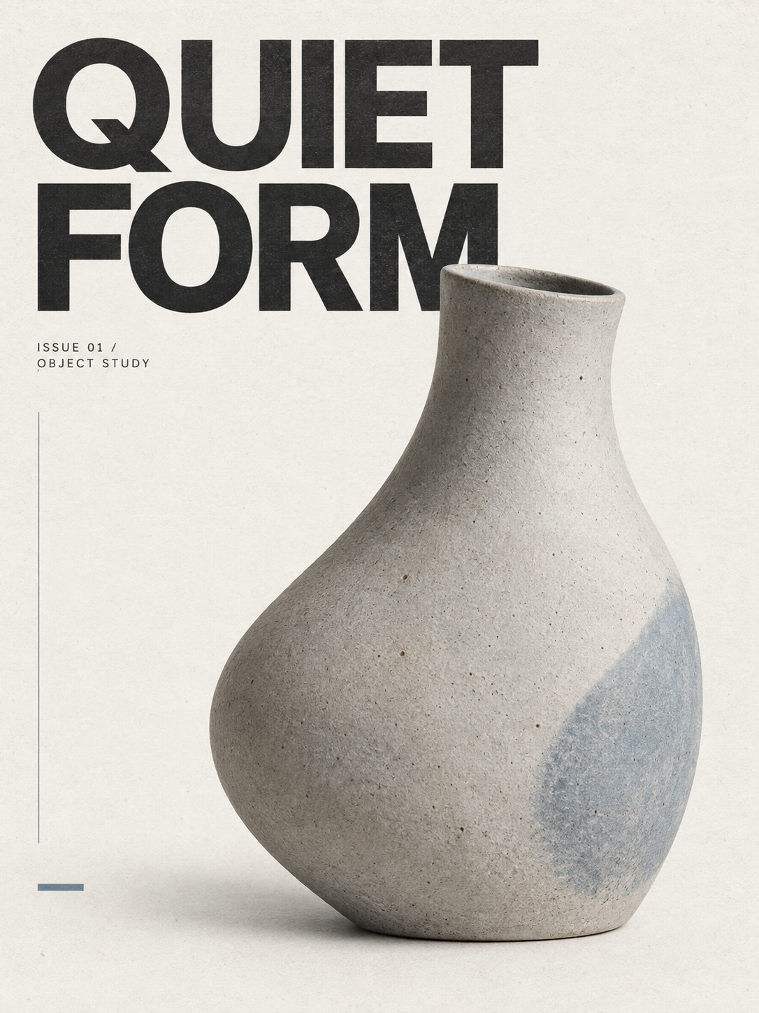
ミニマリスト独立系雑誌ポスターデザインのプロンプト
Minimalist Independent Magazine Poster Design Prompts
「ミニマリスト独立系雑誌ポスターデザインのプロンプト」は gpt-image-2.5 を使用した作品です。OpenZhenZhen で元のプロンプトと生成例を確認し、創作の参考にできます。
プロンプト
中国語プロンプト
为 a single sculptural ceramic vessel 设计一张3:4竖版极简杂志海报;没有替换值时使用默认示例。让唯一核心主体成为清晰的视觉焦点,可以完整展示、大胆局部裁切、出血到边缘或非对称摆放,但不要引入第二个核心主体。 采用独立设计刊物封面语言:克制、安静、前卫并具有当代感。背景使用暖白、灰白或极低饱和纯色,保留充足干净留白。使用严格的瑞士网格和非对称编辑版式,信息层级限定为三级:超大主标题、唯一核心主体和少量辅助信息。 将大号粗体无衬线主标题设为“QUIET FORM”。标题控制在2–6个词以内,必须清晰可读,同时允许被主体部分遮挡、延伸到边缘或非对称排列。使用小号中性无衬线字体呈现 ISSUE 01 / OBJECT STUDY,作为期号、日期、栏目名或简短说明,不添加密集文案。 将调色控制在黑、白、灰和一种低饱和强调色之间,并使用 gray-blue 作为强调色。加入轻微纸张纤维、油墨颗粒和克制的印刷套色偏差,但不要过度做旧。整体应像独立设计工作室制作的限量刊物封面,而不是普通宣传海报。 避免装饰元素堆叠、复杂背景、多核心主体、花哨字体、渐变发光、金属特效、廉价科技感、装饰性贴纸、无意义图形、额外可读文字、标志和水印。
英語プロンプト
Design a 3:4 vertical minimalist magazine poster for a single sculptural ceramic vessel, using the defaults when no replacement is supplied. Make the single core subject the clear visual focus; it may be fully shown, boldly cropped, bleed beyond an edge or placed asymmetrically, but do not introduce a second core subject. Use the cover language of an independent design publication: restrained, quiet, avant-garde and contemporary. Set the background in warm white, off-white or a very low-saturation solid tone, preserving generous clean negative space. Use a strict Swiss grid with an asymmetric editorial layout and a hierarchy limited to three levels: the oversized main title, the single core subject, and a small amount of auxiliary information. Set the large bold sans-serif title to “QUIET FORM”. Keep it between 2 and 6 words, clearly readable while allowing partial occlusion by the subject, edge extension or asymmetric placement. Use ISSUE 01 / OBJECT STUDY in a small neutral sans-serif font as issue, date, column or short-description information. Do not add dense copy. Control the palette to black, white, gray and one low-saturation accent color, using gray-blue as the accent. Add slight paper fibers, ink grain and restrained printing-registration deviation without heavy aging. The result should feel like a limited-edition cover from an independent design studio, not a common promotional poster. Avoid stacked decorative elements, complex backgrounds, multiple core subjects, fancy fonts, gradient glows, metallic effects, cheap tech styling, decorative stickers, meaningless graphics, extra readable text, logos and watermarks.
画像・動画プロンプトをもっと見る · 画像を生成 · 動画を生成 · AI キャンバスで作成
関連作品
- 90年代クールトーン仙侠風 翡翠色漢服の人物像
「90年代クールトーン仙侠風 翡翠色漢服の人物像」は gpt-image-2.5 を使用した作品です。OpenZhenZhen で元のプロンプトと生成例を確認し、創作の参考にできます。
- 超精巧3Dコミック風スター收藏ポスター
「超精巧3Dコミック風スター收藏ポスター」は gpt-image-2.5 を使用した作品です。OpenZhenZhen で元のプロンプトと生成例を確認し、創作の参考にできます。
- レトロレーシングポスターのデザインプロンプト
「レトロレーシングポスターのデザインプロンプト」は gpt-image-2.5 を使用した作品です。OpenZhenZhen で元のプロンプトと生成例を確認し、創作の参考にできます。
- ちびキャラチャットスタンプ生成プロンプト
「ちびキャラチャットスタンプ生成プロンプト」は gpt-image-2.5 を使用した作品です。OpenZhenZhen で元のプロンプトと生成例を確認し、創作の参考にできます。
- 子ども向け科学百科ポスター ミツバチを知ろう
「子ども向け科学百科ポスター ミツバチを知ろう」は gpt-image-2.5 を使用した作品です。OpenZhenZhen で元のプロンプトと生成例を確認し、創作の参考にできます。
- ファッションカラーブロックコラージュポートレート写真
「ファッションカラーブロックコラージュポートレート写真」は gpt-image-2.5 を使用した作品です。OpenZhenZhen で元のプロンプトと生成例を確認し、創作の参考にできます。