OpenZhenZhen AI プロンプトギャラリー · gpt-image-2.5 · image
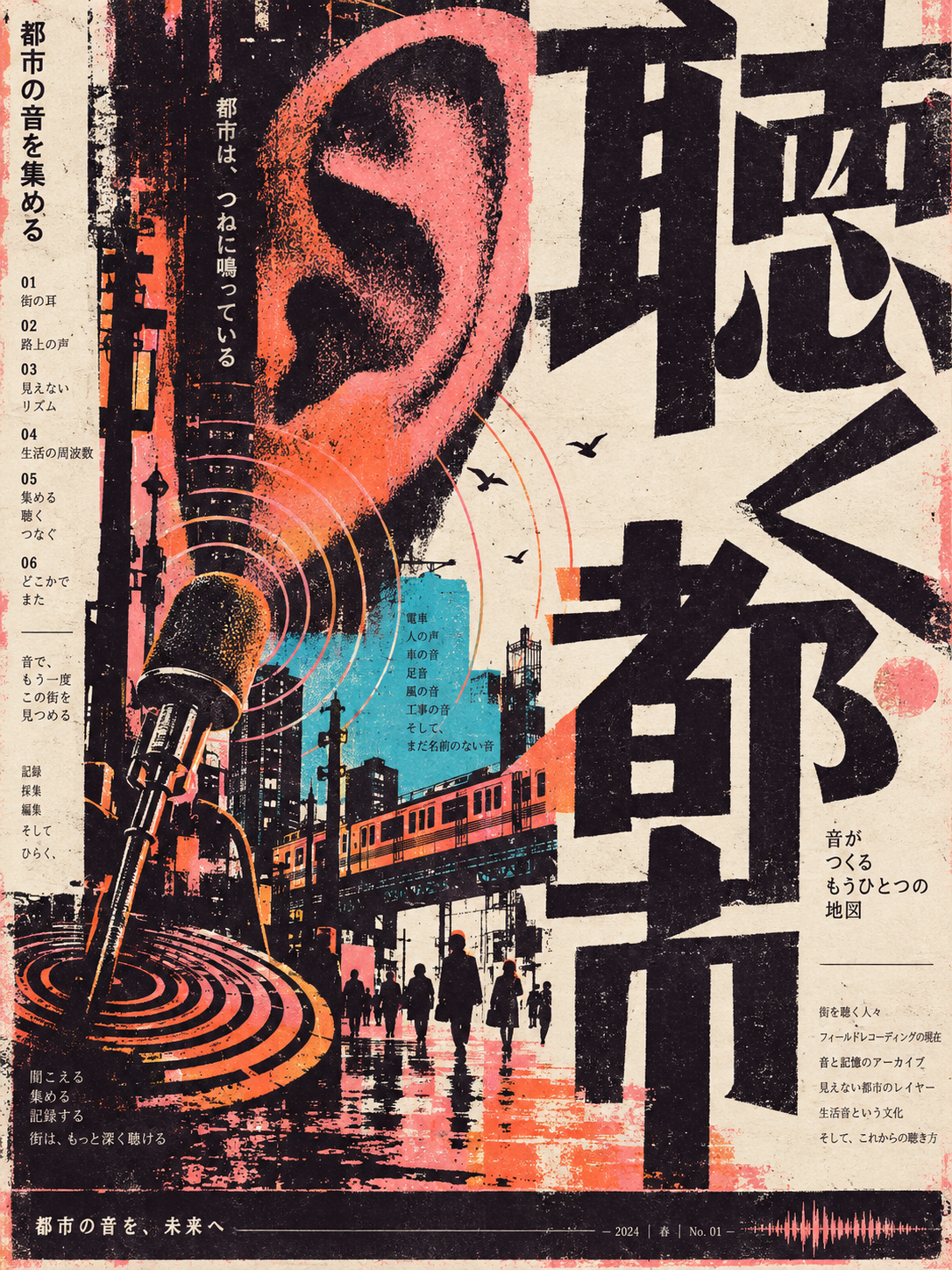
実験的タイポグラフィと物理的な印刷痕の文化誌表紙
Experimental Typography and Physical Print Traces Cultural Journal Cover
「実験的タイポグラフィと物理的な印刷痕の文化誌表紙」は gpt-image-2.5 を使用した作品です。OpenZhenZhen で元のプロンプトと生成例を確認し、創作の参考にできます。
プロンプト
中国語プロンプト
创作一张关于城市声音采集的竖版3:4文化刊物封面。先以城市聆听的放大核心符号和从画面边缘切入的大型黑色字形或抽象文字结构形成冲击,再让高饱和扁平插图与文字产生有意的遮挡、切入和套印错位关系。采用偏窄的竖向编排与强烈留白,引导视线经过大型标题字形、紧凑主题插图、细密信息栏和底部信息条。以暗紫黑为主色,使用朱橙、珊瑚粉和一小块冷青作为高饱和视觉跳点,让浅米色纸面负责呼吸。标题使用右对齐的超大原创字形和局部反白,强调夸张比例、厚重笔画、紧凑字距、锐利或不对称端点、偶尔相连的转折与开放反白空间;保持字形骨架在不同文字系统中仍清晰连贯。细小的目录式注释沿左边缘纵向排列,并保持次要。左下放置由同心声波、麦克风轮廓和断续线条组成的紧凑插图簇;使用少量纯色块、剪影、重复纹样和局部细线,不追求写实。保留粗粝印刷边缘、局部套色偏移、纸张底色不均、轻微套印错位、边缘溢墨和局部褪色,仿佛经过实体制版印刷。保持清晰的阅读路径,让留白沿对角线展开并把视线引向底部信息条。不要使用平滑渐变、玻璃光泽、过度对称、数字化锐化、商业海报式美化、标志、水印或无关的可读文字。整体应像一张精致、实验性、具有触觉印刷证据的文化刊物封面。
英語プロンプト
Create a vertical 3:4 culture-magazine cover about city sound collection. Begin with a magnified core symbol of urban listening and oversized black glyphs or abstract text structures cutting in from the frame edges, then overlap them with a high-saturation flat illustration so text and image create deliberate cut-in and misregistration relationships. Use a narrow vertical arrangement and strong whitespace, guiding the eye through the large title forms, compact theme illustration, dense information columns, and bottom information bar. Use dark purple-black as the dominant field, with vermilion orange, coral pink, and one small block of cold cyan as high-saturation jump points; let light beige paper provide breathing room. Set the title as right-aligned oversized original glyphs with partial inversion, exaggerated proportions, heavy strokes, tight spacing, sharp or asymmetric terminals, occasional connected turns, and open counters; keep the glyph skeleton legible and coherent across writing systems. Arrange small directory-like annotations vertically along the left edge and keep them secondary. In the lower-left, place a compact illustration cluster of concentric sound ripples, microphone outlines, and intermittent lines; use a few pure color blocks, silhouettes, repeating patterns, and local thin lines rather than realism. Preserve rough printed edges, local spot-color shifts, uneven paper base color, slight registration misalignment, edge ink overflow, and localized fading, as if produced by physical platemaking. Keep the central reading path clear, with whitespace unfolding diagonally toward the bottom information bar. Use no smooth gradients, glass gloss, excessive symmetry, digital sharpening, commercial beautification, logos, watermarks, or unrelated readable text. The result should feel like a sophisticated experimental cultural publication cover with tactile handmade print evidence.
画像・動画プロンプトをもっと見る · 画像を生成 · 動画を生成 · AI キャンバスで作成
関連作品
- 90年代クールトーン仙侠風 翡翠色漢服の人物像
「90年代クールトーン仙侠風 翡翠色漢服の人物像」は gpt-image-2.5 を使用した作品です。OpenZhenZhen で元のプロンプトと生成例を確認し、創作の参考にできます。
- 超精巧3Dコミック風スター收藏ポスター
「超精巧3Dコミック風スター收藏ポスター」は gpt-image-2.5 を使用した作品です。OpenZhenZhen で元のプロンプトと生成例を確認し、創作の参考にできます。
- レトロレーシングポスターのデザインプロンプト
「レトロレーシングポスターのデザインプロンプト」は gpt-image-2.5 を使用した作品です。OpenZhenZhen で元のプロンプトと生成例を確認し、創作の参考にできます。
- ちびキャラチャットスタンプ生成プロンプト
「ちびキャラチャットスタンプ生成プロンプト」は gpt-image-2.5 を使用した作品です。OpenZhenZhen で元のプロンプトと生成例を確認し、創作の参考にできます。
- 子ども向け科学百科ポスター ミツバチを知ろう
「子ども向け科学百科ポスター ミツバチを知ろう」は gpt-image-2.5 を使用した作品です。OpenZhenZhen で元のプロンプトと生成例を確認し、創作の参考にできます。
- ファッションカラーブロックコラージュポートレート写真
「ファッションカラーブロックコラージュポートレート写真」は gpt-image-2.5 を使用した作品です。OpenZhenZhen で元のプロンプトと生成例を確認し、創作の参考にできます。