OpenZhenZhen AI プロンプトギャラリー · gpt-image-2.5 · image
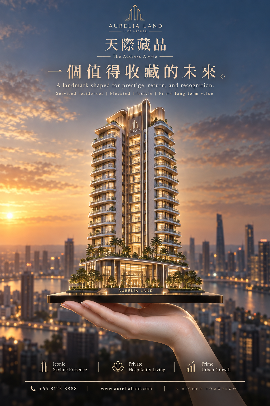
AURELIA LAND 雲耀のスカイライン不動産ポスター
Aurelia Land: Cloud-Glow Skyline Real Estate Poster
「AURELIA LAND 雲耀のスカイライン不動産ポスター」は gpt-image-2.5 を使用した作品です。OpenZhenZhen で元のプロンプトと生成例を確認し、創作の参考にできます。
プロンプト
中国語プロンプト
以用户上传的参考图作为主要可见人物的面部身份依据。在不与身份参考冲突的情况下,保留来源的场景、造型、服装、姿势、构图、光线和视觉风格。 Create a premium vertical flagship real-estate advertising poster for a fictional luxury property developer brand called AURELIA LAND, promoting its iconic serviced-residence tower project “云曜天际” with the English subtitle “The Address Above”. The image must merge Orbit-style upward momentum with Transit-style editorial restraint, while making the brand memory unmistakably strong through a singular architectural identity, a disciplined logo system, and a high-recognition visual symbol. The building must remain the absolute visual hero. Core concept: A refined luxury high-rise tower rises from a razor-thin dark premium platform resting on a realistic adult human hand in the lower foreground. The hand symbolizes ownership, elevation, and control, but remains secondary. The main brand memory device is the tower itself: it must have a distinctive signature silhouette with elegant stepped balcony bands and a recognizable crown profile, so the architecture becomes an instantly identifiable brand icon. The entire poster should feel like one unforgettable commercial symbol: a branded tower held above the city. Composition: Vertical poster, highly centralized composition, strong symmetry with subtle premium asymmetry in light and skyline depth. The tower stands at exact center, occupying the visual core and extending upward into generous negative space. The platform is thin, dark, glossy, and engineered, acting like a luxury pedestal-device hybrid. A realistic hand supports the platform from below, emerging from the lower edge with correct anatomy and understated presence. The upper half contains a tightly controlled premium typography system with clear brand hierarchy. The lower section contains only a reduced, elegant information structure. No clutter. Orbit direction: Strengthen the feeling of ascent and elevation. The tower should feel as if it is being presented upward toward the sky, with balcony lines, facade rhythm, lighting gradation, and podium geometry all guiding the eye vertically. The silhouette should become slimmer and more luminous toward the upper levels. Palm trees, podium lighting, and platform perspective should subtly reinforce an upward lift. The visual energy is not chaotic; it is a calm, prestigious rise. Transit restraint: Keep the layout extremely clean and premium. Remove all unnecessary decorative elements, excessive text blocks, or busy urban distractions. The skyline in the background is soft, blurred, and minimal. The poster should read in one second: brand, tower, aspiration. Typography must be sparse, measured, and elegant. Every element should feel expensive, intentional, and globally marketable. Architecture: An internationally upscale 14-to-16-story luxury serviced-residence tower with a highly memorable form: sculpted stepped terraces, continuous wraparound balconies, warm interior light, floor-to-ceiling low-iron glass, champagne-bronze frame accents, pale limestone or travertine surfaces, transparent corner glazing, and a refined hospitality-style podium with double-height lobby glass. The crown should have a distinctive final-tier expression, elegant but instantly recognizable. The tower must look architecturally credible, developer-grade, investment-worthy, and beautifully buildable. Brand identity emphasis: Create a strong, cohesive visual branding system. At the very top, place a minimal geometric logo mark derived from the tower’s silhouette, paired with the brand name AURELIA LAND in a refined luxury wordmark. Introduce one restrained signature brand accent color, muted champagne gold, repeated only in the logo mark, one key headline word, and a thin divider line, so the identity becomes memorable without becoming noisy. The tower silhouette, logo form, and balcony rhythm should feel like one unified brand language. The image must not feel like a generic property ad; it must feel like a proprietary flagship campaign. Typography and layout: Use original, premium, restrained text only. Top: the AURELIA LAND logo system. Below: project name “云曜天际”. Main Chinese headline: “一座被记住的天际资产”. Smaller English line: “A landmark shaped for prestige, return, and recognition.” Add one ultra-minimal descriptor line beneath: “Serviced residences | Elevated lifestyle | Prime long-term value”. At the bottom, reduce to three concise icon-led selling points such as “Iconic Skyline Presence”, “Private Hospitality Living”, “Prime Urban Growth”, followed by a clean, narrow contact strip. Typography should be spacious, balanced, high-end, and clearly subordinate to the architecture. Lighting: Golden sunset transitioning into early dusk, with soft radiant sky light, warm architectural interior glow, controlled highlights on metal trims and balcony slabs, and subtle rim light around the tower silhouette. The light should help the tower separate cleanly from the background and amplify its brand-icon status. Strong but elegan
英語プロンプト
Use the uploaded reference image as the facial identity reference for the main visible person. Keep the source scene, styling, clothing, pose, composition, lighting and visual style unless they conflict with the identity reference. Create a premium vertical flagship real-estate advertising poster for a fictional luxury property developer brand called AURELIA LAND, promoting its iconic serviced-residence tower project “云曜天际” with the English subtitle “The Address Above”. The image must merge Orbit-style upward momentum with Transit-style editorial restraint, while making the brand memory unmistakably strong through a singular architectural identity, a disciplined logo system, and a high-recognition visual symbol. The building must remain the absolute visual hero. Core concept: A refined luxury high-rise tower rises from a razor-thin dark premium platform resting on a realistic adult human hand in the lower foreground. The hand symbolizes ownership, elevation, and control, but remains secondary. The main brand memory device is the tower itself: it must have a distinctive signature silhouette with elegant stepped balcony bands and a recognizable crown profile, so the architecture becomes an instantly identifiable brand icon. The entire poster should feel like one unforgettable commercial symbol: a branded tower held above the city. Composition: Vertical poster, highly centralized composition, strong symmetry with subtle premium asymmetry in light and skyline depth. The tower stands at exact center, occupying the visual core and extending upward into generous negative space. The platform is thin, dark, glossy, and engineered, acting like a luxury pedestal-device hybrid. A realistic hand supports the platform from below, emerging from the lower edge with correct anatomy and understated presence. The upper half contains a tightly controlled premium typography system with clear brand hierarchy. The lower section contains only a reduced, elegant information structure. No clutter. Orbit direction: Strengthen the feeling of ascent and elevation. The tower should feel as if it is being presented upward toward the sky, with balcony lines, facade rhythm, lighting gradation, and podium geometry all guiding the eye vertically. The silhouette should become slimmer and more luminous toward the upper levels. Palm trees, podium lighting, and platform perspective should subtly reinforce an upward lift. The visual energy is not chaotic; it is a calm, prestigious rise. Transit restraint: Keep the layout extremely clean and premium. Remove all unnecessary decorative elements, excessive text blocks, or busy urban distractions. The skyline in the background is soft, blurred, and minimal. The poster should read in one second: brand, tower, aspiration. Typography must be sparse, measured, and elegant. Every element should feel expensive, intentional, and globally marketable. Architecture: An internationally upscale 14-to-16-story luxury serviced-residence tower with a highly memorable form: sculpted stepped terraces, continuous wraparound balconies, warm interior light, floor-to-ceiling low-iron glass, champagne-bronze frame accents, pale limestone or travertine surfaces, transparent corner glazing, and a refined hospitality-style podium with double-height lobby glass. The crown should have a distinctive final-tier expression, elegant but instantly recognizable. The tower must look architecturally credible, developer-grade, investment-worthy, and beautifully buildable. Brand identity emphasis: Create a strong, cohesive visual branding system. At the very top, place a minimal geometric logo mark derived from the tower’s silhouette, paired with the brand name AURELIA LAND in a refined luxury wordmark. Introduce one restrained signature brand accent color, muted champagne gold, repeated only in the logo mark, one key headline word, and a thin divider line, so the identity becomes memorable without becoming noisy. The tower silhouette, logo form, and balcony rhythm should feel like one unified brand language. The image must not feel like a generic property ad; it must feel like a proprietary flagship campaign. Typography and layout: Use original, premium, restrained text only. Top: the AURELIA LAND logo system. Below: project name “云曜天际”. Main Chinese headline: “一座被记住的天际资产”. Smaller English line: “A landmark shaped for prestige, return, and recognition.” Add one ultra-minimal descriptor line beneath: “Serviced residences | Elevated lifestyle | Prime long-term value”. At the bottom, reduce to three concise icon-led selling points such as “Iconic Skyline Presence”, “Private Hospitality Living”, “Prime Urban Growth”, followed by a clean, narrow contact strip. Typography should be spacious, balanced, high-end, and clearly subordinate to the architecture. Lighting: Golden sunset transitioning into early dusk, with soft radiant sky light, warm architectural interior glow, controlled highlights on metal trims and balcony slabs, and sub
画像・動画プロンプトをもっと見る · 画像を生成 · 動画を生成 · AI キャンバスで作成
関連作品
- 90年代クールトーン仙侠風 翡翠色漢服の人物像
「90年代クールトーン仙侠風 翡翠色漢服の人物像」は gpt-image-2.5 を使用した作品です。OpenZhenZhen で元のプロンプトと生成例を確認し、創作の参考にできます。
- 超精巧3Dコミック風スター收藏ポスター
「超精巧3Dコミック風スター收藏ポスター」は gpt-image-2.5 を使用した作品です。OpenZhenZhen で元のプロンプトと生成例を確認し、創作の参考にできます。
- レトロレーシングポスターのデザインプロンプト
「レトロレーシングポスターのデザインプロンプト」は gpt-image-2.5 を使用した作品です。OpenZhenZhen で元のプロンプトと生成例を確認し、創作の参考にできます。
- ちびキャラチャットスタンプ生成プロンプト
「ちびキャラチャットスタンプ生成プロンプト」は gpt-image-2.5 を使用した作品です。OpenZhenZhen で元のプロンプトと生成例を確認し、創作の参考にできます。
- 子ども向け科学百科ポスター ミツバチを知ろう
「子ども向け科学百科ポスター ミツバチを知ろう」は gpt-image-2.5 を使用した作品です。OpenZhenZhen で元のプロンプトと生成例を確認し、創作の参考にできます。
- ファッションカラーブロックコラージュポートレート写真
「ファッションカラーブロックコラージュポートレート写真」は gpt-image-2.5 を使用した作品です。OpenZhenZhen で元のプロンプトと生成例を確認し、創作の参考にできます。