OpenZhenZhen AI プロンプトギャラリー · gpt-image-2.5 · image
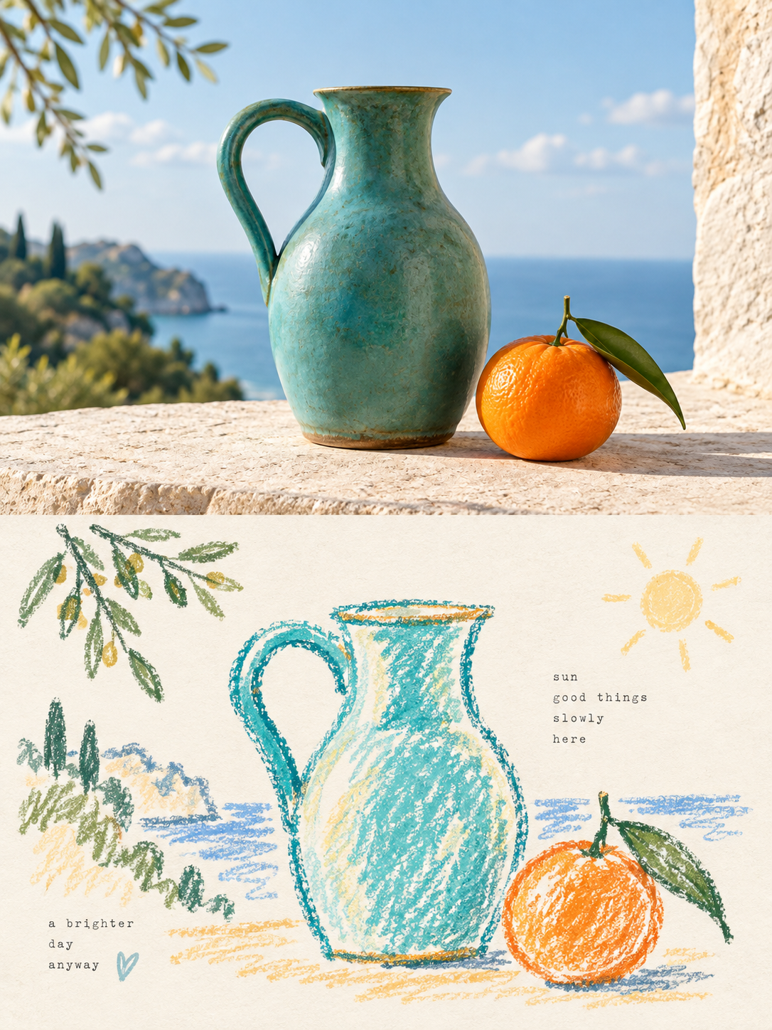
写真をレトロなクレヨン落書きの余白ポスターに
Photo to Retro Crayon Sketch Poster with Negative Space
「写真をレトロなクレヨン落書きの余白ポスターに」は gpt-image-2.5 を使用した作品です。OpenZhenZhen で元のプロンプトと生成例を確認し、創作の参考にできます。
プロンプト
中国語プロンプト
图1是为source_photo生成的配套素材,作为本次编辑工作流对应位置实际使用的输入图像。 使用上传的 source_photo 创建一张独立的高级设计海报。不要制作多图拼贴;每上传一张照片,就单独输出一张海报。画布采用 3:4 竖版构图,上下两个区域高度严格相等,各占画面 50%。 上半部分保留源照片的主体身份、结构、姿态、真实质感、自然光线和原有色彩氛围。只进行轻微高级调色,使其具有艺术杂志、独立出版物或展览图像质感。需要适配画幅时可以自然延展环境背景,但不得拉伸、扭曲或改变源主体。如果源照片包含人物,应从 source_photo 保留该人物身份,不要套用其他固定人物参考图。 下半部分先理解源照片最值得记住的核心主题、主体关系、结构走势、情绪和视觉隐喻,再只保留最具代表性的轮廓、姿态、方向和视觉记忆点,重构为带复古纸张肌理的轻松稚拙涂鸦插画。不要逐物复制,也不要完整重绘整张照片。使用粗颗粒粉笔或蜡笔式轮廓:线条松弛、干涩、略微抖动、断续掉色、局部不闭合,笔端自然钝圆。内部只加入极少量粉彩色块、简单网格、条纹、圆点或随手涂抹,不做写实体积和完整细节。 将周围的星星、花朵、植物、器物、环境线索或抽象符号压缩成同一线条语言下的一笔或几笔涂鸦标记。让主体与极少量符号形成松散群落,周围保留大量主动留白。构图可以偏心、贴边、悬置或局部裁切,通过大小反差、不对称以及空与实的关系创造呼吸感;宁可少画,也不要填满。 使用极浅、明亮、干净的近白纸面,例如奶油白、象牙白、浅米白、淡杏白或极浅灰白,并根据源照片色温匹配。只保留很轻微的纸张纤维和颗粒,不要深色、发黄或陈旧纸面。背景明度必须明显高于线条与色块。从源照片提取 2-4 种鲜活且亲和的颜色,重新调制为柔和粉彩蜡笔色,如蜜桃、杏橙、奶油黄、薄荷、天空蓝、淡紫、珊瑚、柔蓝或青绿色。避免脏褐色、沉闷低对比莫兰迪色、荧光色和廉价糖果色。 只加入少量从源主体、动作、情绪、记忆或隐喻中提炼的短句或文字片段。使用轻薄、疏朗、带轻微字距不齐的打字机感字体,自然散落在留白处并与涂鸦混排。不要固定标题模板、无关文案或水印。最终应呈现浅色纸面、粗颗粒蜡笔线条、少量粉彩填色、极简涂鸦符号和大量艺术留白,松弛、治愈、天真但成熟且具有编辑设计感。避免写实转绘、精细光滑描边、复杂图标、填满背景、平滑矢量、3D 渲染和商业模板感。
英語プロンプト
Image 1 is the generated supporting image for source_photo; use it as the actual input for the corresponding slot in this editing workflow. Use the uploaded source_photo to create one independent premium design poster. Do not make a multi-image collage; each uploaded photo receives its own output. Use a 3:4 vertical canvas divided into two regions with exactly equal height, 50% top and 50% bottom. In the upper half, preserve the source photo's subject identity, structure, posture, realistic texture, natural lighting and original color atmosphere. Apply only subtle high-end grading with an art-magazine, independent-publication or exhibition-image feel. Extend environmental background naturally when needed, but never stretch, distort or change the source subject. If the source contains a person, preserve that person's identity from source_photo; do not apply a different identity reference. In the lower half, first understand the source's memorable theme, subject relationships, structural direction, emotion and visual metaphor. Reconstruct only the strongest contours, postures, directions and memory points as a relaxed naive graffiti illustration on vintage paper texture. Do not copy every object or redraw the entire photo. Use thick-grained chalk/crayon outlines that are loose, dry, slightly shaky, intermittently faded and partly open, with blunt rounded ends. Add only a very small amount of pastel fills, simple grids, stripes, dots or casual smears; avoid realistic volume and complete detail. Compress surrounding stars, flowers, plants, objects, environmental clues or abstract symbols into simple one- or few-stroke graffiti marks in the same line language. Keep a small subject community surrounded by generous active white space. The layout may be eccentric, edge-aligned, suspended or partially cropped; use scale contrast, asymmetry and empty-versus-solid relationships to create breathing room. Prefer drawing less over filling the page. Use an extremely light clean near-white paper base: cream, ivory, pale beige, pale apricot or very light gray-white, matched to the source temperature. Keep only subtle fibers and particles; never use dark, yellowed or aged paper. The background must be much brighter than the lines and color blocks. Extract 2-4 vivid friendly source colors and reformulate them as soft pastel crayon colors such as peach, apricot, cream yellow, mint, sky blue, light purple, coral, soft blue or cyan-green. Avoid dirty brown, dull low-contrast Morandi palettes, fluorescents and cheap candy color. Add only a small amount of freely extracted short text or fragments from the source subject, action, emotion, memory or metaphor. Use thin sparse typewriter-like lettering with slight irregular spacing, placed naturally in the white space and mixed with the graffiti. No fixed title template, unrelated copy or watermark. The final design should feel healing, relaxed, naive yet mature and editorial, with a pale paper field, coarse crayon lines, minimal pastel fills, tiny graffiti symbols and abundant artistic white space. Avoid realistic redrawing, fine polished strokes, complex icons, filled backgrounds, smooth vectors, 3D rendering and commercial template styling.
画像・動画プロンプトをもっと見る · 画像を生成 · 動画を生成 · AI キャンバスで作成
関連作品
- 90年代クールトーン仙侠風 翡翠色漢服の人物像
「90年代クールトーン仙侠風 翡翠色漢服の人物像」は gpt-image-2.5 を使用した作品です。OpenZhenZhen で元のプロンプトと生成例を確認し、創作の参考にできます。
- 超精巧3Dコミック風スター收藏ポスター
「超精巧3Dコミック風スター收藏ポスター」は gpt-image-2.5 を使用した作品です。OpenZhenZhen で元のプロンプトと生成例を確認し、創作の参考にできます。
- レトロレーシングポスターのデザインプロンプト
「レトロレーシングポスターのデザインプロンプト」は gpt-image-2.5 を使用した作品です。OpenZhenZhen で元のプロンプトと生成例を確認し、創作の参考にできます。
- ちびキャラチャットスタンプ生成プロンプト
「ちびキャラチャットスタンプ生成プロンプト」は gpt-image-2.5 を使用した作品です。OpenZhenZhen で元のプロンプトと生成例を確認し、創作の参考にできます。
- 子ども向け科学百科ポスター ミツバチを知ろう
「子ども向け科学百科ポスター ミツバチを知ろう」は gpt-image-2.5 を使用した作品です。OpenZhenZhen で元のプロンプトと生成例を確認し、創作の参考にできます。
- ファッションカラーブロックコラージュポートレート写真
「ファッションカラーブロックコラージュポートレート写真」は gpt-image-2.5 を使用した作品です。OpenZhenZhen で元のプロンプトと生成例を確認し、創作の参考にできます。