Галерея ИИ-промптов OpenZhenZhen · gpt-image-2.5 · image
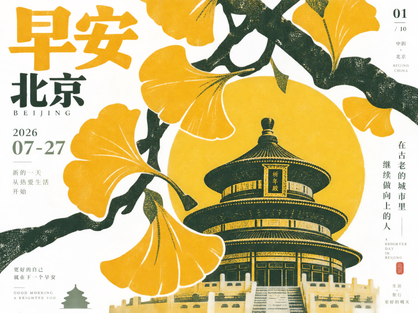
Утренний плакат храма Неба в Пекине в стиле ручной печати
Hand-Printed Style Beijing Temple of Heaven Good Morning Poster
«Утренний плакат храма Неба в Пекине в стиле ручной печати» — работа с использованием gpt-image-2.5 на OpenZhenZhen. Изучите исходный промпт и пример генерации для собственных проектов.
Промпт
Промпт на китайском
围绕北京与早安海报生成一组共10张、每张4:3的手工印刷感信息海报;当前画面使用系列序号1,城市元素为天坛元素,日期或短信息为2026-07-27,金句为金句,主色逻辑为明亮清新的单一主色,深色枝轴与少量低饱和信息辅助色。将主题转译成数个饱满、近距离放大的圆润主形体,沿偏中轴的粗壮分枝结构自然串联;主形体彼此挤压但保留清晰呼吸空隙,局部被画面边缘裁切,形成丰盛、新鲜的第一视觉。让分枝、叶片或城市派生符号以深色结构层覆盖主形体,呈现套印版画般的轻微错位、透明叠色与粗糙边缘,使图形平面化又具有植物般的生长方向。背景为高明度、清透干净的浅色纸面,保留细密纤维颗粒、轻微压印和少量手工磨损,但不得变脏、发灰或陈旧。遵循明亮清新的单一主色,深色枝轴与少量低饱和信息辅助色:每张使用不同的明亮主色,深色承担枝轴与符号结构,小面积信息文字采用低饱和且清晰可读的辅助色,维持高明度底场、鲜明主形、有限套色和清爽对比。文字只作为图像秩序的一部分,组合粗重标题、紧凑日期式信息、小号边缘竖排或角落标记,分布在边缘与留白处,不抢走主形体的第一视觉。整体结合复古丝网印刷与现代清新海报,图形大、边缘硬中带毛、信息少而有节奏,避免写实摄影、复杂背景、过度装饰和拥挤说明。默认示例为“早安海报 + 北京天坛元素 + 2026-07-27 + 金句”,并生成该系列的第1张;整组共10张,每张城市和主色不同。
Промпт на английском
Generate a set of 10 hand-printed informational posters, each in 4:3, around 北京 and 早安海报. This image uses series index 1; the city motifs are 天坛元素, the date or short information is 2026-07-27, the quote is 金句, and the color direction is 明亮清新的单一主色,深色枝轴与少量低饱和信息辅助色. Translate the theme into several plump, close-up enlarged rounded main shapes, naturally connected along a thick branching structure near the central axis. Let the main shapes press against one another while retaining clear breathing gaps, with some forms cropped by the frame for an immediate sense of abundance and freshness. Cover the shapes with dark structural branches, leaves, or city-derived symbols, using slight misregistration, transparent overprinting, and rough edges like a screen print; keep the graphics flat yet guided by plant-like growth. Use a bright, clear, clean light paper background with fine fiber particles, slight embossing, and limited handmade wear, never dirty, gray, or aged. Follow 明亮清新的单一主色,深色枝轴与少量低饱和信息辅助色 so every poster has a different bright dominant color; reserve dark tones for the branch axis and symbols, and use a low-saturation but legible support color for small information text. Maintain a high-value ground, vivid main forms, limited inks, and crisp contrast. Treat typography as part of the image order: combine a bold title, compact date-like information, small edge-oriented vertical type or corner marks, keeping it in margins and negative space so it does not overpower the main forms. Blend vintage screen-print character with a modern fresh poster; use large graphics, hard-but-fibrous edges, and sparse rhythmic information. Avoid realistic photography, complex backgrounds, excessive decoration, and crowded explanations. The default example is “早安海报 + 北京天坛元素 + 2026-07-27 + 金句”, and this is series image 1; the full set contains 10 images, each with a different city and dominant color.
Больше промптов для изображений и видео · Создать изображение · Создать видео · Создать на ИИ-холсте
Похожие работы
- Ретро-платье на одно плечо в красно-белых тонах, японская девушка Budweiser 90-х
«Ретро-платье на одно плечо в красно-белых тонах, японская девушка Budweiser 90-х» — работа с использованием gpt-image-2.5 на OpenZhenZhen. Изучите исходный промпт и пример генерации для собственных проектов.
- Классическая дама у лотосового пруда в угасающем свете
«Классическая дама у лотосового пруда в угасающем свете» — работа с использованием gpt-image-2.5 на OpenZhenZhen. Изучите исходный промпт и пример генерации для собственных проектов.
- Постер выставки культуры бамбукового плетения в эстетике современного Востока
«Постер выставки культуры бамбукового плетения в эстетике современного Востока» — работа с использованием gpt-image-2.5 на OpenZhenZhen. Изучите исходный промпт и пример генерации для собственных проектов.
- Спортивная женщина в платье-поло цвета травы
«Спортивная женщина в платье-поло цвета травы» — работа с использованием gpt-image-2.5 на OpenZhenZhen. Изучите исходный промпт и пример генерации для собственных проектов.
- Крупный портрет взрослой восточноазиатской женщины с холодным макияжем
«Крупный портрет взрослой восточноазиатской женщины с холодным макияжем» — работа с использованием gpt-image-2.5 на OpenZhenZhen. Изучите исходный промпт и пример генерации для собственных проектов.
- Минималистичный экспериментальный типографический плакат к Празднику середины осени
«Минималистичный экспериментальный типографический плакат к Празднику середины осени» — работа с использованием gpt-image-2.5 на OpenZhenZhen. Изучите исходный промпт и пример генерации для собственных проектов.